Know the Common Blunders with Styling Stripes and Avoid Those!
The timeless fashion choice could be tempting but it is prudent to know how stripes could go wrong.
- Puja Sinha
- 31 May, 2025
- 2 mins ago

Know the Common Blunders with Styling Stripes and Avoid Those!
The timeless fashion choice could be tempting but it is prudent to know how stripes could go wrong.
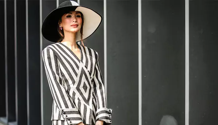
Styling stripes can be a bit tricky because the pattern has the power to elevate or completely derail an outfit. Whether you are going for a bold statement or a subtle accent, here are some common errors to avoid when styling stripes, along with reasons why they can lead to a fashion faux pas.
The basics of stripe fashion dictate tat horizontal stripe create an illusion of width while diagonal stripes are more dynamic. Chevron striped could be flattering and vertical stripes are a saviour if you are keen on creating a slimming effect. Now what are the fundamentals of stipes fashion?
Mismatching Stripe Widths
Combining stripes of varying widths, such as wide stripes on a top and thin stripe on a bottom, messes the look. The difference in stripe widths creates visual inconsistency, making the outfit appear chaotic. Instead, try sticking with stripes that are similar in width for a cohesive and streamlined appearance.
Ignoring Body Type
Not considering how stripes interact with your body shape is a major facepalm moment. Horizontal stripes tend to widen the body, while vertical stripes elongate and slim it. For example, if you want to accentuate height or create a leaner silhouette, vertical stripes are your friend. Not considering the body shape can result in a less flattering fit, especially if you’re aiming for a certain body proportion.
Stripes Overdose
Wearing stripes from head to toe, such as pairing a striped top with striped pants and accessories is what we call stripes OD. Too many stripes can be disjointing and overwhelming to look at. If everything in the outfit has stripes, it leads to visual clutter. Balancing by incorporating solid pieces with striped elements creates a harmonious blend.
Not Considering Colour Contrast
Choosing stripes with little contrast between the colours: a pale blue on white. Low-contrast stripes can blur together and lose their definition, especially from a distance. This can make the outfit appear washed out or less impactful. Go for stripes with clear colour distinctions to heighten the pattern.
Direction of Stripes Goes on a Toss
Mixing vertical, horizontal, and diagonal stripes within the same outfit makes you a walking zig-zag of lines. Different stripe directions clash and create confusion, disrupting the aesthetics of the outfit. Instead, stick to one consistent direction for a cleaner look, or if you do mix directions, do so intentionally—such as a vertically striped shirt paired with a diagonally striped scarf, where the contrast adds interest rather than distraction.
Overlooking Occasion Appropriateness
Wearing bold, eye-catching stripes for formal or sombre events is synonymous to going overboard with stripes and is definitely not advised. While stripes can be playful and fun, some patterns, particularly bold or bright ones, may not fit formal occasions. Subdued or subtle stripe patterns are more tone appropriate.
Neglecting Accessory Choices
Adding heavily patterned accessories (like polka-dot or floral scarves) to a striped outfit. Too many competing patterns can clash, creating a visual overload. If you're wearing stripes, let them shine by pairing them with neutral or minimalist accessories to avoid making the outfit too busy.
Not Aligning Stripes at Seams
Wearing garments where the stripes do not align at the seams, such as at the shoulders, side seams, or hems, is a big NO. Misaligned stripes can create a visually jarring effect, making an otherwise sleek outfit appear sloppy. Look for well-constructed pieces where the stripes flow seamlessly across the garment.
Stripes is chic, but they require careful styling to avoid common pitfalls. By paying attention to stripe size, direction, colour palette, and body type, you can ensure that stripes work in your favour, making your look cohesive, balanced, and flattering.


